UX Design
The Kōura Kete
Flash cards celebrating the legacy of the land which takahanga marae sits on and how it provided sustenance for people and hospitality for guests in the aftermath of the Kaikōura earthquakes.

Role
Research
Design & Illustration
Tools
Procreate
Adobe InDesign
Adobe Illustrator
Adobe Photoshop
The Kōura Kete
This concept celebrates the legacy of the land which takahanga marae sits on and how it provided sustenance for people and hospitality for guests in the aftermath of the Kaikōura earthquakes, an inference to mana whenua.
The purpose of the flash cards is to inform tamariki about kai by showing the user a picture of a fruit or vegetable with its name on the opposite side of the card.
This concept is timeless in its application and can be used by everybody in the marae to connect with tamariki and preserve the legacy of the land, giving back to the marae for generations to come.


The Brief
Takoha can be translated as a present, an offering, a gift, a donation or a contribution, it’s a custom that is common across the world. Within Te Ao Māori (the Māori world), koha is a long standing custom that traditionally took the form of food and other gifts such as mats and baskets.
The koha given reflects the mana of both the giver and the receiver, reflecting what the giver is able to give, and the esteem they hold for the person or group they are gifting to. This project acknowledges indigenous peoples within Aotearoa and the knowledge they offer is included and represented throughout this design process. Whilst understanding that we all have diverse backgrounds, and cultural heritages this koha is a combination of a reciprocal understanding.
The focus of my koha centralised around a specific scenario:
“You were on holiday in Kaikoura when the earthquake struck (2016). There was no transport in or out of the town and one of the local marae in the area had graciously feed and housed you for the week. To thank the marae for hosting you create an appropriate koha for the people and land that sustained you.”


Contextual Understanding
I felt a gift is not a gift without truly understanding the person whom and context within which the gift is given and I believe that you cannot design anything in life without first understanding those whom you are designing for. Therefore, my design process was guided by a not only a comprehensive, but also a cohesive understanding of the context within which I was giving my koha, to ensure that every single design element resonated and engaged with the users.


What’s in the Kete?
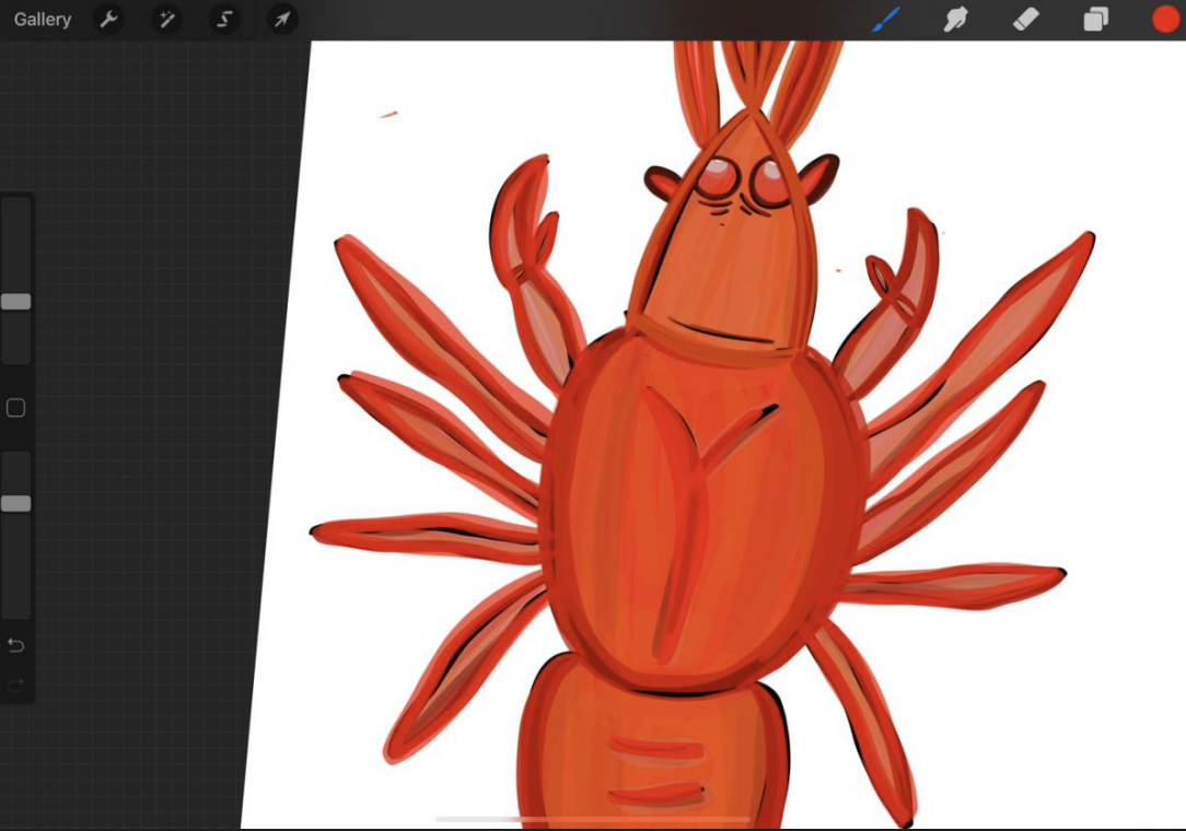
Objects chosen celebrate the legacy of the land which takahanga marae sits on by preserving their culture and tradition for future generations; this is an inference to mana whenua and recognition that I feel was unacknowledged after the earthquakes. Kōura honours the meaning and history behind Kaikōura’s name, “eat crayfish”, alluding to Tama kit e Rangi’s eating of crayfish over the fire during his exploration of the South Island (Ngāi Tahu, n.d.), along with the notion that Kaikōura was, in māori history, seen as “an ideal place for settlement” due to the sustenance provided by food from the ocean (Whale Watch, 2020).


The illustrations
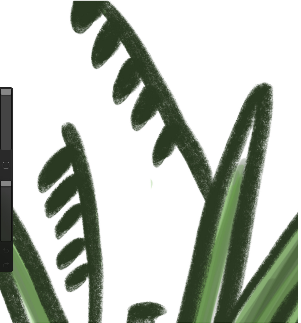
I also wanted all of my illustrations to interconnect, almost as if the flash cards are telling a story. Hence, Haraekeke has been included as an allusion to its use in lashing together traditional craypots; it is a derivative of the land that is of incredible significance to māori due to its traditional use in clothing and the tikanga associated with it: “The tikanga around harvesting harakeke is grounded in common sense and protects the welfare of both the harvester and harakeke plant itself.” (Christchurch City Libraries, 2020). Harakeke also represents whānau (Te Ara, 2007), hence I felt its inclusion alluded to the engagement end users will have with my koha. The incorporation of Kūmara is an inference to its historical place within Kaikōura’s land, which dates back to its cultivation by early māori settlers at Mikonui Bay in the 1820’s (NZTA, 2016).


The finer details
The finer details in my koha, like colour, were also chosen with consciousness to their māori symbolism. For example, whero is prominent in my koha because it symbolises Papatūānuku, the earth mother, who gives birth to all things, including trees, birds and people, each of whom are born from the land, which then nourishes them (Te Ara, 2007). This is conscious inference to mana whenua and the way the land provides sustenance to sustain the people, directly honouring how takahanga marae sustained me after the earthquakes. Kākāriki honours my personal being as a mountain lover and alongside Kaikōura being home to a quarter of the native plants species in the country (Kaikōura District Council, 2020); use of this colour also recognises fauna, such as the harakeke I’ve included, a derivative of the land and further inference to Papatūānuku. Fundamental details such as information layout, hierarchy and typography have been chosen with readability in mind due to the diverse range of end-users engaging with my koha.
The learnings
One cannot design without understanding who they are designing for.
In all honesty, using underlying research of “whom, what and why” in regards to mana whenua and takahanga marae to guide the design of my koha emphasised to me just how sad it is that cultural appropriation and disregard of māori culture exists so prevalently, when information has never been more accessible, and our self-perception as a society supposedly never “more inclusive”.
Growing as a designer goes beyond the technicalities.
To me, designing through a decolonised lens involves going beyond cultural “acknowledgement” into visible cultural understanding and recognition, something that I have tried to achieve in my koha particularly as throughout this process, I have been incredibly disappointed to read about the lack of recognition takahanga marae and Kaikōura mana whenua have had in the aftermath of the Kaikōura earthquakes.
Design isn’t just about the art, it’s about the heart.
Designing with consciousness has emphasised to me that when we pay attention to the underlying meaning of our designs, they become so much more powerful; my koha has been emotionally gift wrapped in the aroha and consciousness with which I’ve grounded my design approach with.
References
Christchurch City Libraries. (2020). Harakeke. Retrieved from: https://my.christchurchcitylibraries.com/harakeke/
Kaikoura District Council. (2020). Biodiversity. Retrieved from: https://www.kaikoura.govt.nz/our-district/environment/biodiversity/
Ngāi Tahu. (n.d.). The Ngāti Kurī/Ngāi Tahu Relationship With Whales. Retrieved from: https://ngaitahu.iwi.nz/te-runanga-o-ngai-tahu/papatipurunanga/kaikoura/ngati-kuringai-tahu-relationship-whales/
NZTA. (2016). Hurunui/Kaikōura Coastal Route Desktop Assessment of Archaelogical and Heritage Sites. Retreived from: https://www.nzta.govt.nz/assets/projects/kaikoura-earthquake-response/nctircoastal-route-consents/compiled-appendices/kaikoura-north.pdf
Te Ara. (2008). Kūmara. Retrieved from: https://teara.govt.nz/en/kumara/print
Te Ara. (2007). Story: Te Waonui a Tāne – forest mythology. Retrieved from: https://teara.govt.nz/en/diagram/13162/harakeke-plant
Te Ara. (2011). Kaumātua – Māori elders. Retrieved from: https://teara.govt.nz/en/kaumatua-maori-elders
Whale Watch. (2020). Stories and Culture. Retrieved from: https://www.whalewatch.co.nz/our-people/stories-and-culture/