UX Design
Sweat it, don’t spread it.
Reducing Covid-19 transmission at fitness classes through the power of infographics.
Role
User Research
Design & Illustration
User Testing
Tools
Procreate
Adobe InDesign
Adobe Illustrator
“AH-CHOOOOOOO!” … !
The sound of the dreaded sneeze became all the more intolerable after the emergence of Covid-19 into our little bayside community, North of Auckland.
An eventual return to high intensity interval training (HIIT) classes left me ecstatic. We were equipped with a plethora of Covid-19 precautions; however, the threat of Covid-19 appeared to have magically disappeared for many - no bringing towels, no social distancing…
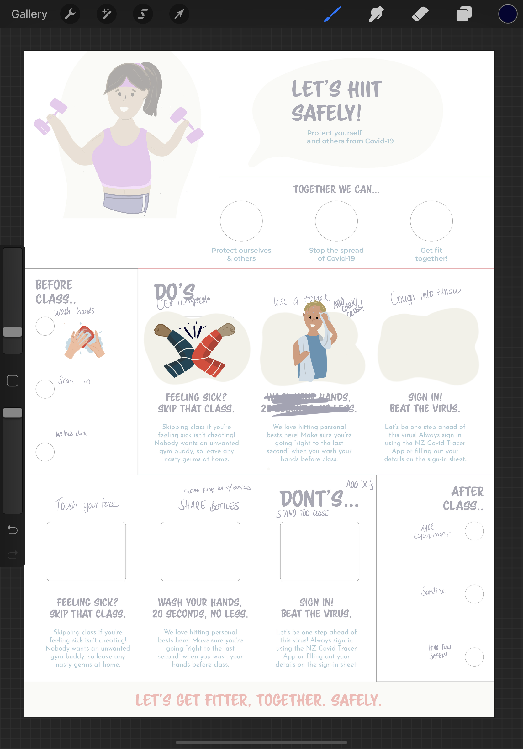
With a pre-defined design medium of an A1 infographic, the challenge was clear:
How might we help users identify practices that limit the spread of Covid-19 and implement these during HIIT classes?


The research
SECONDARY
Initial secondary research helped understand the problem’s context and inform primary research goals.
Encouraging the adoption of Covid-19 prevention measures first meant defining what exactly these constituted through secondary research, alongside how and if these were currently being implemented through observational primary research.
It was also important to understand how people consume information about covid-19, to help develop an optimal content strategy to effectively deliver the infographic’s message.
PRIMARY
Primary observational research enabled me to gain a holistic picture of user’s journeys attending a HIIT class, and the related behaviors and attitudes exhibited at each point in this process.
Whilst user interviews would’ve aided my understanding of the “why” behind user’s behaviours and attitudes, due to a substantial amount of credible secondary research coupled with immense time constraints, the decision was made to limit primary research to observations of two 30 minute HIIT classes alongside the 5 minutes post and prior to these.


A chaotic, multi-dimensional journey
It was apparent the HIIT class is quite a chaotic, multi-dimensional journey with a multitude of varying emotions, actions and environmental characteristics present. This helped me understand what factors might influence user’s reception of content conveyed by the infographic, allowing me to tailor the delivery of this accordingly. It was also evident that a key challenge was going to be ensuring the infographic’s content was able to be interpreted by the audience despite any factors which might influence its reception, such as exhaustion and fatigue.
Key research findings included:
People are often under time pressure before and after HIIT classes.
This manifested itself in a variety of ways, ranging from classes starting and ending immediately post/prior HIIT classes and arriving late, causing users to rush.
Covid-19 thrives in gyms.
This is because of limited venting, many smooth surfaces and the physical exertion they evoke. Preventative measures including contact tracing and personal hygiene practices are integral in limiting Covid-19 droplet transmission.
HIIT classes are a collective process.
This ranged from mutual encouragement and support, positive gestures and clapping throughout the class, which offsets the workout’s difficulty.
Current Covid-19 preventative measures are inadequate.
This is because they are practiced selectively, rendering their effectiveness null. For example, using a towel will stop droplets spreading during class, but failing to sanitise afterward means users are still taking any potential germs home.
HIIT participants experience social pressure.
Users look to others to evaluate their own performance, hesitate to do something until others do it first and will avoid standing directly in front of the instructor.


The content plan
Informed by these insights, a content strategy was developed to ensure the right message was conveyed to users in the right way to achieve the right actions for the desired outcome.
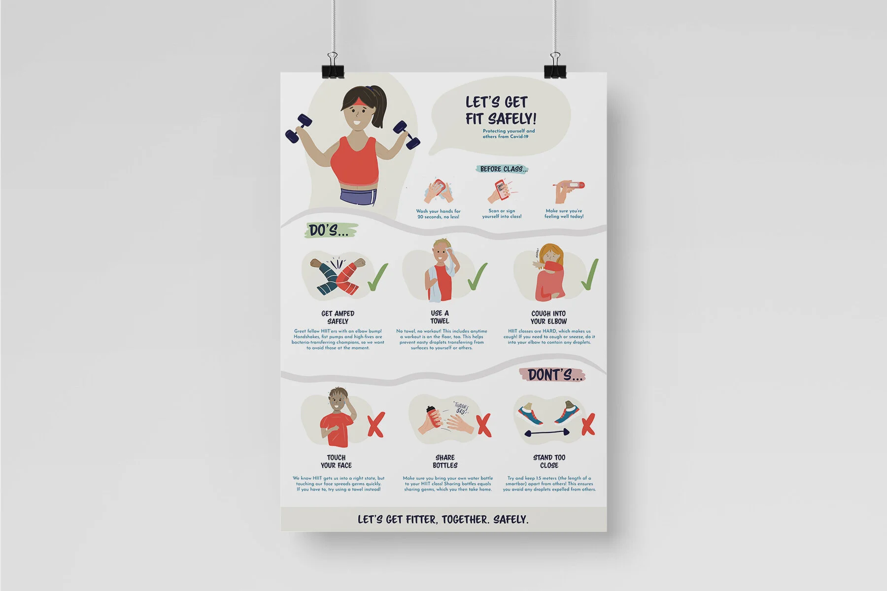
Drawing clear links between the collective characteristics of the HIIT class, society’s collective approach to disaster cooperation and tools used to prevent the spread of covid-19 was going to help the audience understand the importance of the content. This would be executed by adopting a “unified” strategy that addresses the audience collectively, focusing on the benefits of the actions for all HIIT participants.
Illustrations would also play an integral role in executing this strategy, empathising with the range of emotions felt by users throughout the class. The human brain can process images much faster than words, which was important considering the fatigued state in which our users may be digesting the infographic.

The sketches and ideation
Ideation commenced prior to the development of any visual language. This entailed creating a “moodboard” for existing infographics and illustrations which elicited inspiration for my own design, broadening the scope of potential concepts.
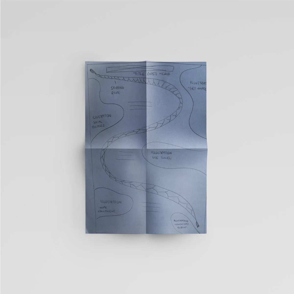
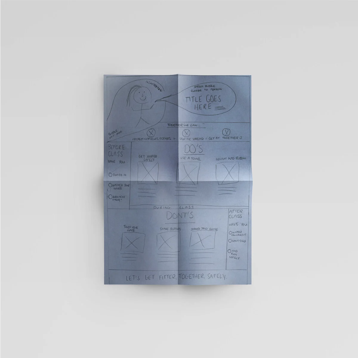
Design development began with sketching. Concept one was chosen due to its easy-to-follow flow, whereas the isometric approach to concept two was felt to require too much energy.
Concept three intended to draw on movement created by an illustration of a HIIT skipping rope; however, the content layout was felt to be too sporadic and hard to differentiate.
The visual language

Colour palette
A complimentary colour palette created contrast between illustrations and written content, so that even if the audience was too fatigued or rushed to read the associated text, the illustration was still eye catching enough to convey the message on its own.

Typography
A handwritten font created empathy for readers through its humanistic connotations whilst contrasting the fatigue and exhaustion of the HIIT class through its “fun” appearance.

Illustration style
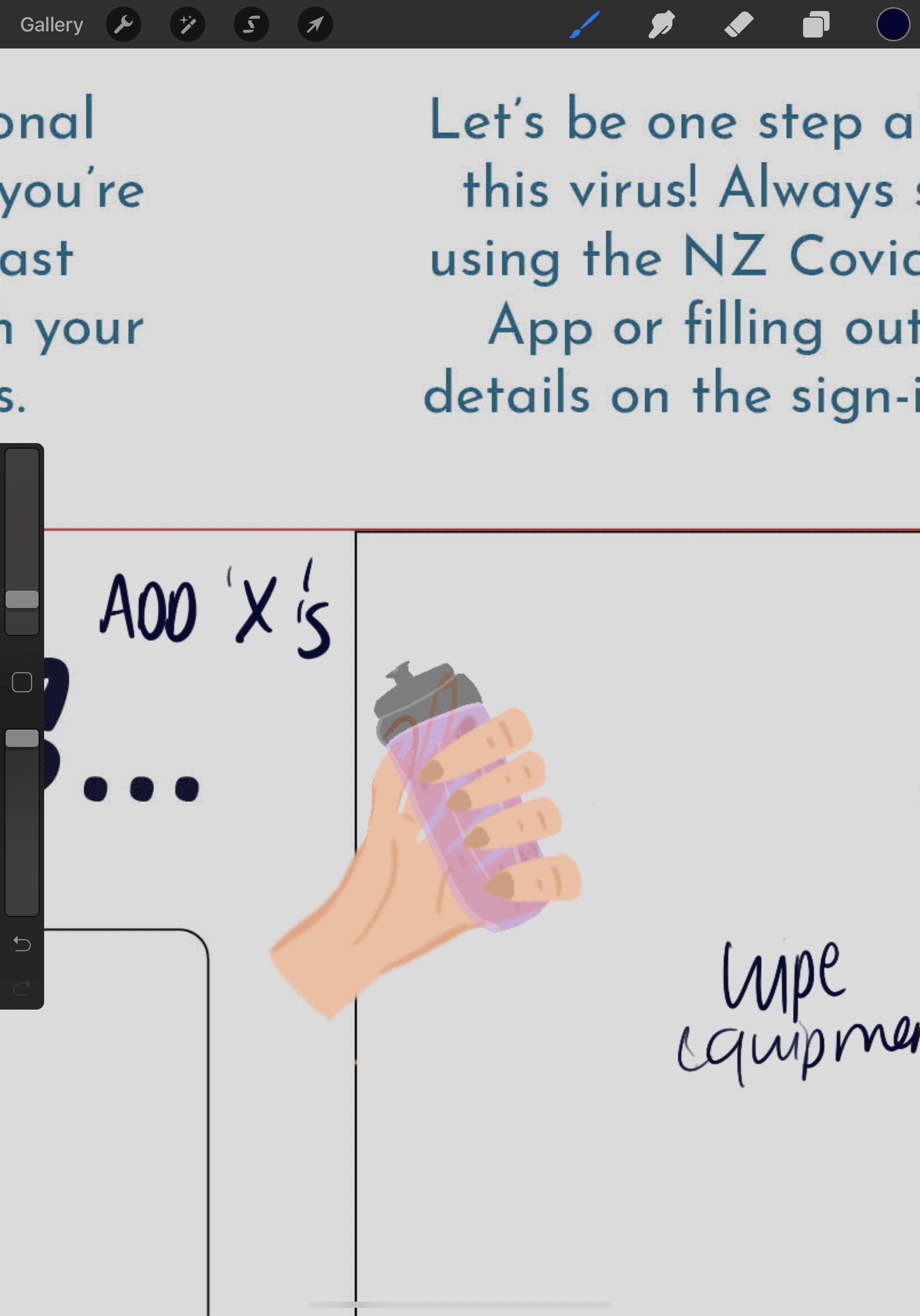
A flat character style was adopted, because it’s simple style makes it rapid for users to identify. Illustrations also all had human elements to help create the empathy sought to achieve in the content strategy.
The user testing
User testing of the final high-fidelity product was completed to evaluate the effectiveness of the content strategy and the visual language used to deliver this. Given the time constraints, the design was tested with a small number of users and focused on obtaining rapid feedback.
A five second test is used to measure how well a design quickly communicates a message, and was a great way of ascertaining how efficiently the infographic communicated its content when viewed by users with time constraints in place.
Because the infographic couldn’t be tested in its intended environment, the time constraints helped substitute the factors which might impede user’s ability to receive the message during a HIIT class, such as fatigue and exhaustion.
Users were then given the opportunity to view the infographic for a longer period of time and asked questions about information layout, illustration meaning and suggested improvements, if any.
The learnings
The problem needn’t be over thought, nor the approach “perfect”.
In this time-sensitive context, too much time was spent trying to “perfectly” approach the challenge. This was detrimental to the project’s progress as it didn’t allow for an equal time balance across each component - I just need to take a stab at the problem, and explore it!
User interviews would have been beneficial.
Without time constraints, user interviews would’ve been an insightful compliment to observational research, as it would’ve unearthed WHY the behaviors and emotions observed were being portrayed. This could have been incorporated, but research depth needed to be traded for efficiency.
With more time, iterative user testing would be adopted.
Adopting iterative user testing with more users would’ve achieved a more refined, well-rounded concept. I was also unable to test with a printed, life size version of the poster, which may have impeded participant’s abilities to accurately provide feedback.
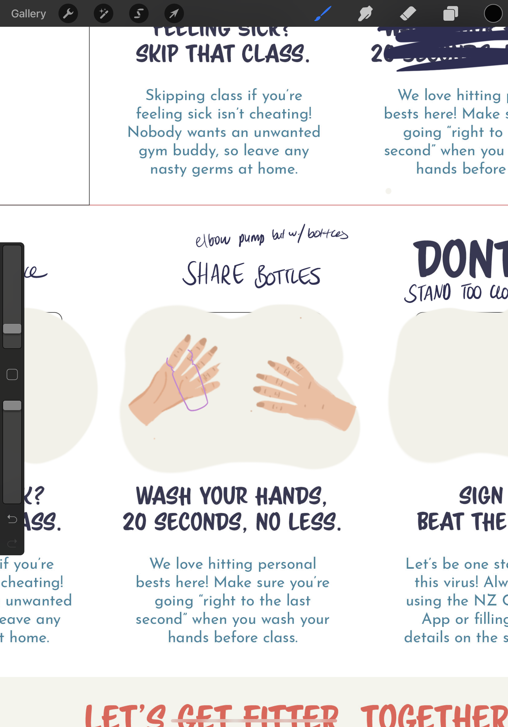
Illustrations are time consuming.
This was a critical learning, as it impeded the quality of my final product. Additional planning and time allowances are required when hand-drawing illustrations, to allow for it’s intricacy and any mishaps in the vectorization process.