UX Design
Saturday.
Designing a centralised, mobile information portal for Silverdale rugby field users.

Role
User Research
UI Design
User Testing
Tools
Figma
Adobe Illustrator
The challenge
For the “coasties” of Auckland’s Whangaparāoa Peninsula, Saturday footy is tradition. It’s a simple pleasure and classic kiwi ritual, but just how simple was it, really? My curiosity heightened noticing an “unofficial” pathway subconsciously created by the thousands of gum-booted players and spectators; an impromptu navigational tool used to access their respective fields.
Through the flurries of mud-trudging amidst looks of confusion, a potential design challenge emerged:
“How might we make it easier to attend rugby at Silverdale Rugby fields?
User research highlighted a range of opportunities for improving efficiency when attending games, informing the design of a high-fidelity prototype mobile application. This aimed to centralise the myriad, multi-faceted channels users currently consulted when accessing the range of information required to attend a game at Silverdale Rugby fields, along with closing any information gaps.


The research
Secondary research was combined with a qualitative primary approach, entailing a series of interviews to gain an understanding of user’s approaches to attending rugby at Silverdale.
These ten users comprised five ‘new’ users for whom this is their first season of attending rugby, and five ‘established’ users for whom this is at least their second season of attendance, enabling me to obtain comprehensive recounts from a diverse range of perspectives and understand any potential impacts that user’s experience levels might have.
The interviews enabled me to explore the experience as a cohesive whole, understanding not only what happens at the field itself, but also any elements of the experience occurring before and after physically arriving.


The insights
Users have a variety of information needs, but the limitations and multitude of channels makes getting this confusing and inefficient.
New users find it difficult to know where to go without asking somebody else because there is no signage or guidance, which makes them late.
All types of users find it difficult to get important information during the game because it isn’t displayed, meaning they have to rely on other spectators to get it.
Participants are often under time pressure when making their way to games because of delays they encounter on their way to the field, causing stress and lateness.


The design brief
Analysis and interpretation of primary and secondary research highlighted various opportunities to make attending rugby at Silverdale rugby fields easier for people. These include getting information without confusion, finding the field without difficulty, preventing lateness and receiving important information more easily during the game.


The ideation
After broad ideation and narrowing down ideas using a value-complexity matrix, it was felt that despite its higher cost, a mobile solution best met the criteria in the design brief. It offers the greatest immediacy, as well as integration with other apps used when going to the rugby, like a phone calendar. It can also be used directly by the user and without constraint, at the push of a button.
A reusable information sheet with a pen attached was also a strong contender, but this couldn’t integrate with any apps, plus it would still require consulting an additional information source. And, placing a continuously updated sign at the field entrance simply wouldn’t have provided key information, like who’s bringing oranges and washing shirts, with enough immediacy.


The prototyping
The level of prototype fidelity required for user testing centralised around the following research objective:
Can people find the information they need in the app, make adjustments to that information, and integrate it with other tools they use?
I felt that the best way to answer this question was by testing a high-fidelity, interactive prototype created in Figma, which sample of users could complete certain tasks on. While a low-fi prototype would’ve allowed me to gain an understanding of general information layout and hierarchy, a key aspect of the design brief was that it needed to be immediate, on-demand and usable without constraint. I felt that a high-fi prototype would allow users to get a better sense of the app’s ability to cater for immediacy because it took away the need to “imagine” its interactivity, which is something I felt might influence their perception.
Deriving from key findings established from the initial user interviews, a series of user flows were created to help pinpoint how users might move through the app while completing key tasks, and identify key screens that needed to be made for testing. A series of wireframes were then sketched, informing the development of an interactive prototype to be tested by users.


The usability testing
A testing guide was developed, comprising tasks focussing on completing the sign-up process, identifying information on the dashboard, adding an extra team and adding a game to a calendar.
While users completed these tasks, observations were made about things like body language, hesitation and order, along with guiding questions asked and probing where necessary.
Sessions were designed to test users understanding of the information displayed and ease of moving between the app and making adjustments depending upon their information needs.
The usability testing sessions aimed to understand & explore:
What level of detail people need in their information to be in a position to get to the rugby fields?
What type of information is most important in ensuring/contributing to being prepared to go a game?
Where do users expect information to be/what locations should information be in?
What level of detail is required to alleviate the need to consult additional channels for further information?
Does the number of children playing rugby affect the level of detail needed and the way people approach getting information?
At what point do users need to consult another app/channel?


The analysis
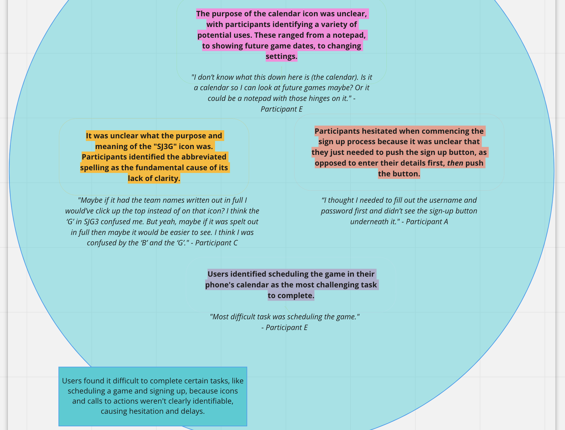
Affinity mapping was used to organise findings from these usability tests, drawing connections and identifying commonalities between these to establish insights, including:
The layout and tone of information used throughout the app was simple, easy to follow and clear, meaning information was immediately identifiable.
Users found it difficult to complete certain tasks, like scheduling a game and signing up, because icons and calls to actions weren’t clearly identifiable, causing hesitation and delays.
Despite initial hesitation, users found that overall, the process of completing the sign up, scheduling and adding a new team was was straightforward, because the the tone of the instructions was friendly, simple and easy to follow.
The app requires additional detail to meet user’s information needs within a single channel, such as a map and distinguishing between who’s bringing clean jerseys, and who’s taking home dirty ones.


The next steps
The insights established from affinity mapping helped to guide some immediate design iterations, including:
The calendar icon was replaced by a word-based approach, which proved to be a much clearer aide than icons.
The distinction between who’s bringing shirts and who’s taking them home was also created, along with the writing out of the team name in full, to eliminate ambiguity.
A map was also included, to allow users to see where specifically they had to go.
The sign up screen was also changed to address the ambiguity when opening the app for the first time, which is absolutely integral in enabling users to actually GET to the information in the first place.
The learnings
Iterate, iterate, iterate.
In the absence of time constraints, the design & development phase of this project would’ve comprised multiple rounds of user testing and iterations. This would’ve resulted in a product that pinpointed user’s needs more accurately and enabled me to gauge the effectiveness of my proposed design improvements.
Probing.
In hindsight, there was certainly opportunity to probe users further during usability testing to increase the depth of my findings. This involves leaving a little more time for pre-practise time of my testing guide in future!