UX/UI Design
Equipment Lighting site development
Lighting up the agricultural lighting sector with a first-in-sector e-commerce experience.
Role
UX/UI Design
Iconography
Content population
UAT testing
Tools
Figma
Adobe Illustrator
Shopify
Jira
The brief
Agricultural lights aren’t a new thing, but a streamlined, intuitive shopping experience that takes the guesswork out of finding lights is an industry first. Our approach? Redefining what it means to connect with the agricultural lighting market through a first-in-sector e-commerce platform that goes beyond selling, to also engage and inform users.
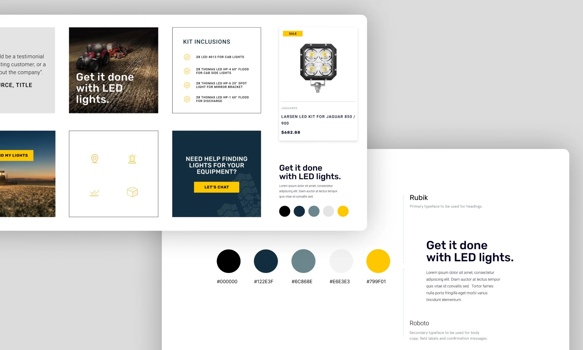
creating a visual identity that not only accompanies, but enhances user’s e-commerce journeys
Supporting journeys through a cohesive visual identity
With Equipment Lighting being an entirely new brand, we needed to create a visual identity that not only supported, but enhanced user’s e-commerce journeys. Rubik was chosen as the primary typeface - it's strong appearance compliments the bold Equipment Lighting branding; however, it’s rounded edges soften any overbearing boldness. Paired with Roboto, a lighter secondary typeface, we were able to optimise legibility and accessibility throughout the purchasing journey. The colour palette was refined to support core brand colours and create clearly defined CTA’s throughout the journey, supported by a custom-designed iconography set to bring visual interest and meaning to core messaging.

eliminating guesswork with clearly defined user journeys
Determining backgrounds, motivations, tasks & context
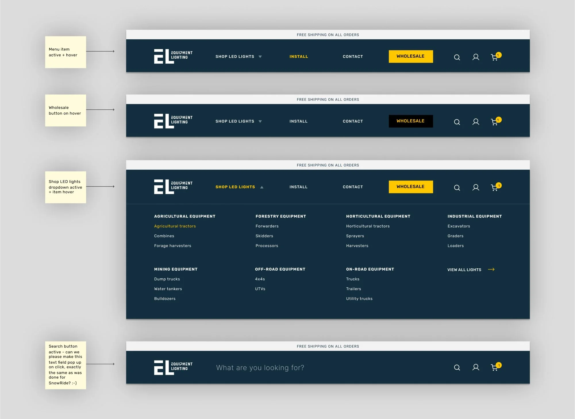
The range of machinery that Equipment Lighting services is almost infinite. However, specific lights are compatible with specific machinery and with almost 30 machinery categories available across the site, ensuring users had a means of conducting a targeted search specific to their individual needs was crucial. Therefore, clearly defined user goals, journeys and sitemapping provided crucial foundations for a seamless, intuitive e-commerce experience. This was evermore important given the project’s time and budget constraints - carefully considered foundations paved the way for (slightly more) seamless wireframing phase.

A carefully considered & handpicked UI design
Execution of the above entailed careful consideration of what a feasible design scope was, given constraints associated with the Shopify platform. Wireframes of core pages were iterated and collaborated continuously with the development team, adopting a “done once, done right” approach. Key components such as mega menus and the integral “search by model” toolbar had to balance user goals, platform constraints and visual engagement. To facilitate an efficient handover of designs to developers, a clearly defined component library was created alongside consistently cross-checking functionality throughout the high-fidelity wireframe process.
iterative bug fixing through rigorous pre and post population UAT testing
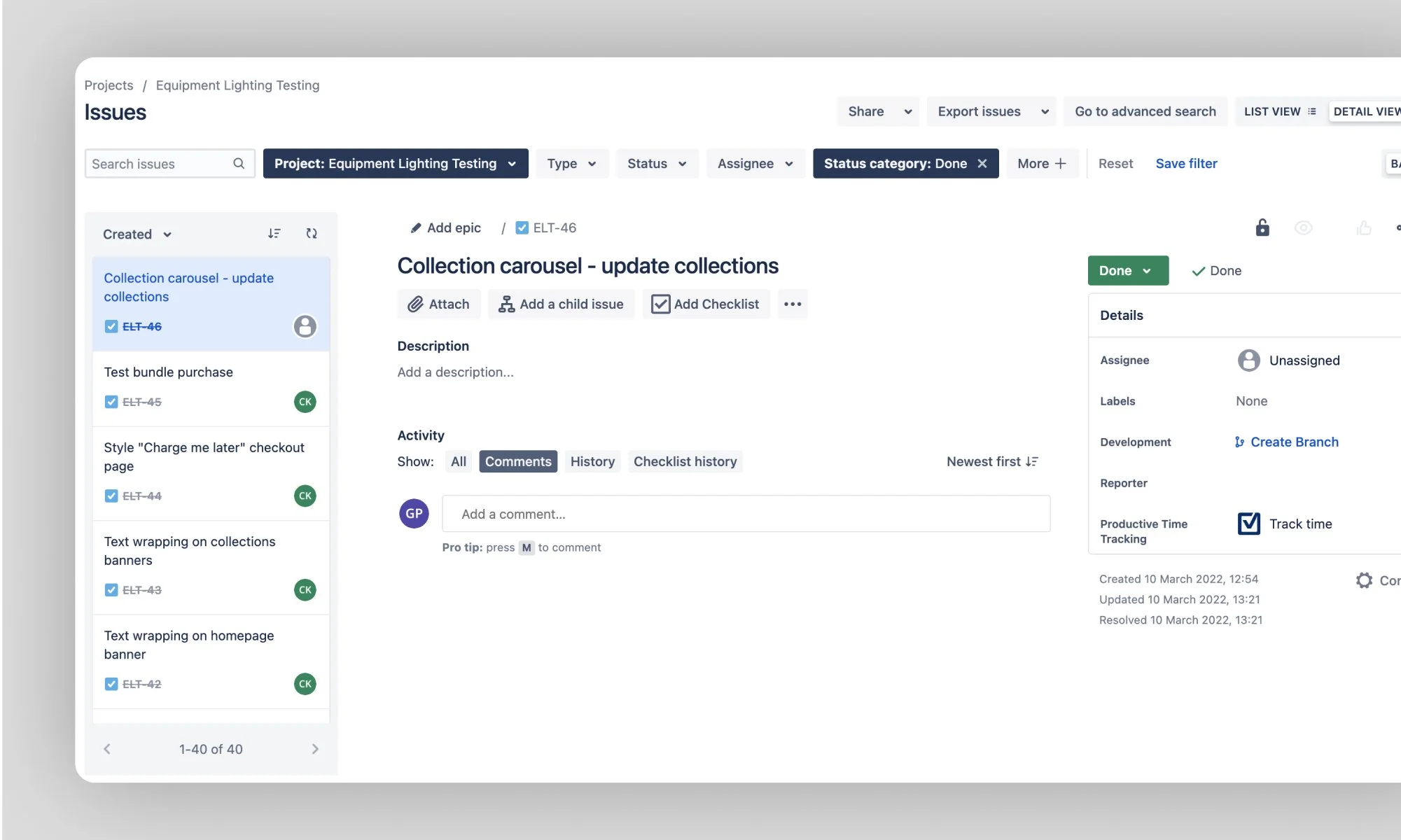
UAT testing & go-live
Rigorous UAT testing ensured users encountered a frictionless journey across a range of devices & scenarios. To pick up any bugs pronounced by content additions, pre and post population testing rounds provided added assurance of intended functionality & aesthetic, and ensuring all user flows were executed as anticipated in-situ. A Jira board grouped by priority & status ensured bugs were documented & communicated - a systematic approach was crucial in ensuring functionality was achieved within the limited timeframe available.
The learnings
Establish design scope ASAP
Ensuring early on that the designs fit within the scope of the development platform you’re working with is absolutely critical. This helps ensure solutions are workable within time, budget and feasibility constraints and avoids re-work further down the track.
Test, test and test some more
Robust testing systems, scenarios and communication is key in ensuring the output is functional as intended.
Collaboration is key
In a multi-faceted project such as a brand launch, it’s crucial to collaborate with your team. A core agency lesson I’ve learnt is that UX/UI should always work in tandem with marketing and development teams, working toward a common goal and ensuring a cohesive output is achieved.