Data Visualisation
Does Pain Equal No Gain?
Investigating and visualising the relationship between injury and cycling performance.
Role
Data collection & analysis
Data visualisation
Tools
Adobe Illustrator
The Challenge
Two wheels are my passion, whether they’re on a mountain, road or gravel, they’re my de-stressor and place to getaway… Or so I thought! During a routine bike ride on September 9, 2020, I was hit by a car – t-boned, in fact. “Oh no!”, I woefully exclaimed, “I’m going to lose ALL my fitness gains!”. But, was this really the case? This project was a fantastic opportunity to explore whether there was really any performance difference after my accident… Or if I was just feeling sorry for myself!


“What narrative is this visualisation trying to convey?”
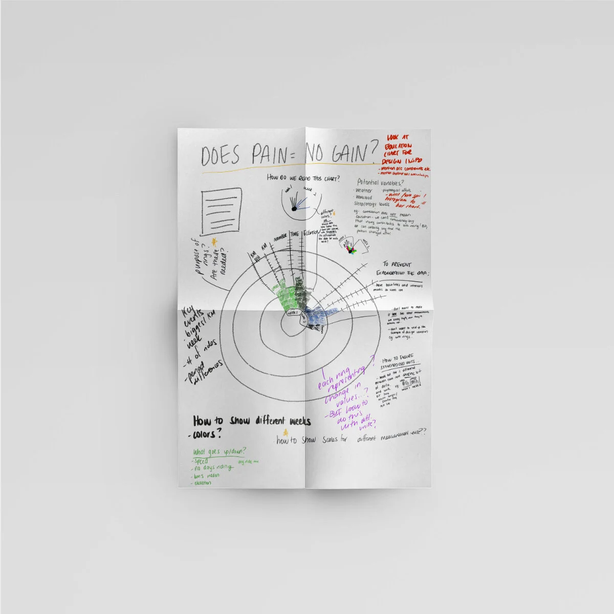
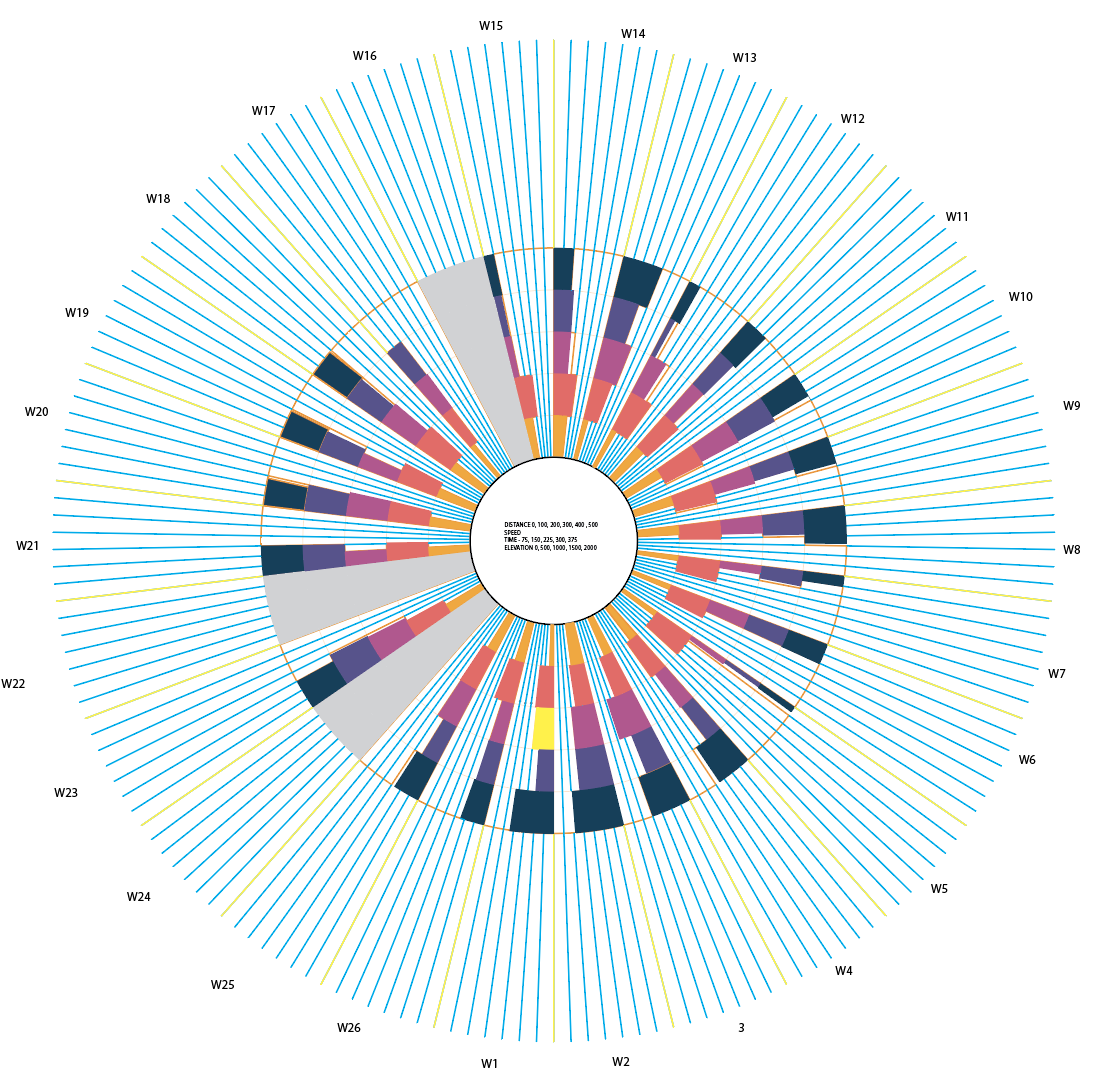
As this question centralised around identifying the existence of a “relationship”, key themes I wanted my visualisation to convey were comparisons and timelines - it was integral that the reader was able to compare the cycling data over the 26-week time period. The biggest challenge I faced was that my dataset was very multidimensional and contained a variety of different measurement units, compounded by the element of showing this not once, but across 26 different instances.
I began scouring through the data viz catalogue and project websites, alongside Pinterest, Behance and renowned data journalist’s portfolios. After initially leaning toward a stacked bar chart due to its ability to clearly display multiple categories and values, I was intrigued by the circular histogram and its ability to do the latter across a timeline.
I felt this chart would better create the sense of movement I wanted achieve (in correlation with a bike wheel) and allow readers to compare data in the most cohesive way possible. Shortly thereafter, I began to sketch some ideas (which continued sporadically as I began to create my final design).

“How on earth am I going to display this?”
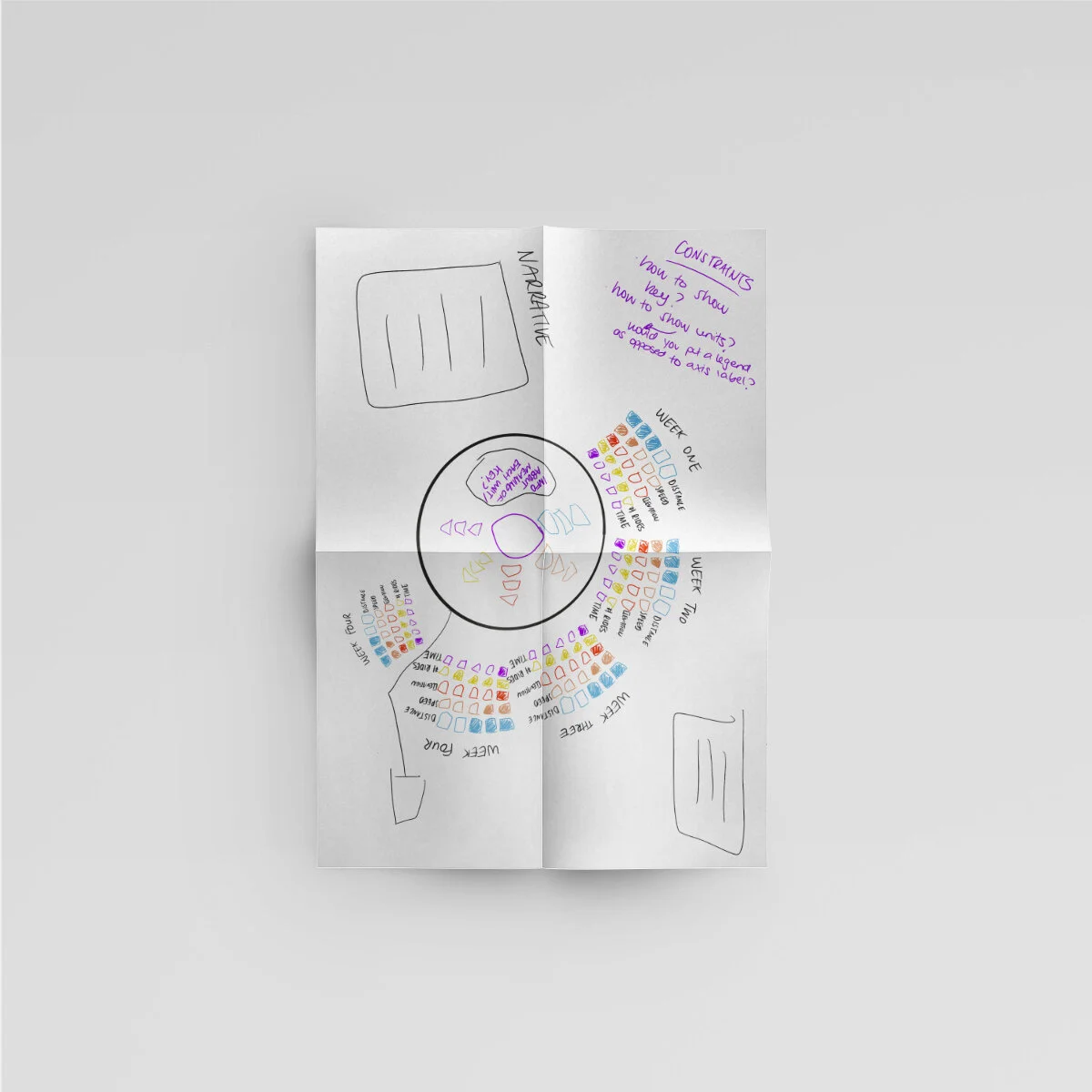
Combined bar charts often appear cluttered and difficult to read, hence I decided to implement vertical, stacked columns to represent each week’s data. This entailed creating a series of outer rings to differentiate each variable and prevent ambiguity, allowing the reader to see the “big picture” and make comparisons more readily.
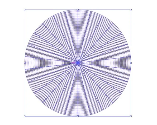
Constructing the chart itself was complicated, entailing a series of back-and-forward experimentation and calculations to create balanced segments and ensure the accurate proportions of all 130 datapoints. Colour choice was guided by WebAim’s colour checker to optimise accessibility and combined with the Newzald font family, chosen due its large x-heights which make for easy legibility.
The hierarchy of text elements was also carefully considered to convey a narrative for the reader early on, subsequently providing context for datapoint interpretation. Coupled with this was the consideration of event label positioning, intentionally aligned with the radius of the chart to create a sense of movement for readers.

What does it all mean?
Whilst the data indicated a decrease in certain performance areas such as elevation and ride duration subsequent to the injury occurring, this didn’t necessarily illustrate a definitive relationship. It’s important to bear in mind the various intangible performance influences such as psychological injury effect, workload and stress that we don’t have data for which also may contribute to variations in this area.
The learnings
Process, process, process.
The extensive array and volume of datapoints made for an intricate (and coffee-filled) design process. Some rework did have to occur throughout the creation process due to the unintended implications of shape-building and warping when creating each datapoint. This was a critical learning curve, highlighting the need to identify the cause-and-effect factors when determining how to “build” a complex design.
User testing would’ve been beneficial.
Without time constraints, user testing would’ve enabled the final design to be iterated and be interpreted by users as optimally as possible.
You can’t guess accuracy.
Taking time to understand critical data visualisation principles was key in understanding how to effectively interpret and convey the data’s meaning. A key learning here was the importance and difficulty of maintaining accurate proportions, particularly with so many datapoints.